Sladez Handyman Services is a family-run business brand designed to feel dependable, straightforward, and professional. The identity uses bold, no-nonsense typography and a clean monochrome palette to communicate trust, strength, and reliability. A simple emblem and strong wordmark ensure instant recognition across vehicles, stationery, and marketing materials, while the consistent layout system supports clear communication in both print and real-world applications. The result is a practical, confident brand identity built to reflect quality workmanship and an honest, hands-on approach to service.
Bare Beauty is a modern beauty brand rooted in softness & luxury. Its minimalist identity blends warm neutral tones with elegant serif typography to create a look that feels feminine and timeless. Designed to translate seamlessly across Printed materials and digital platforms, the brand emphasizes natural beauty through clean design, cohesive visuals, and a versatile monogram, resulting in a polished yet approachable presence in the beauty space.
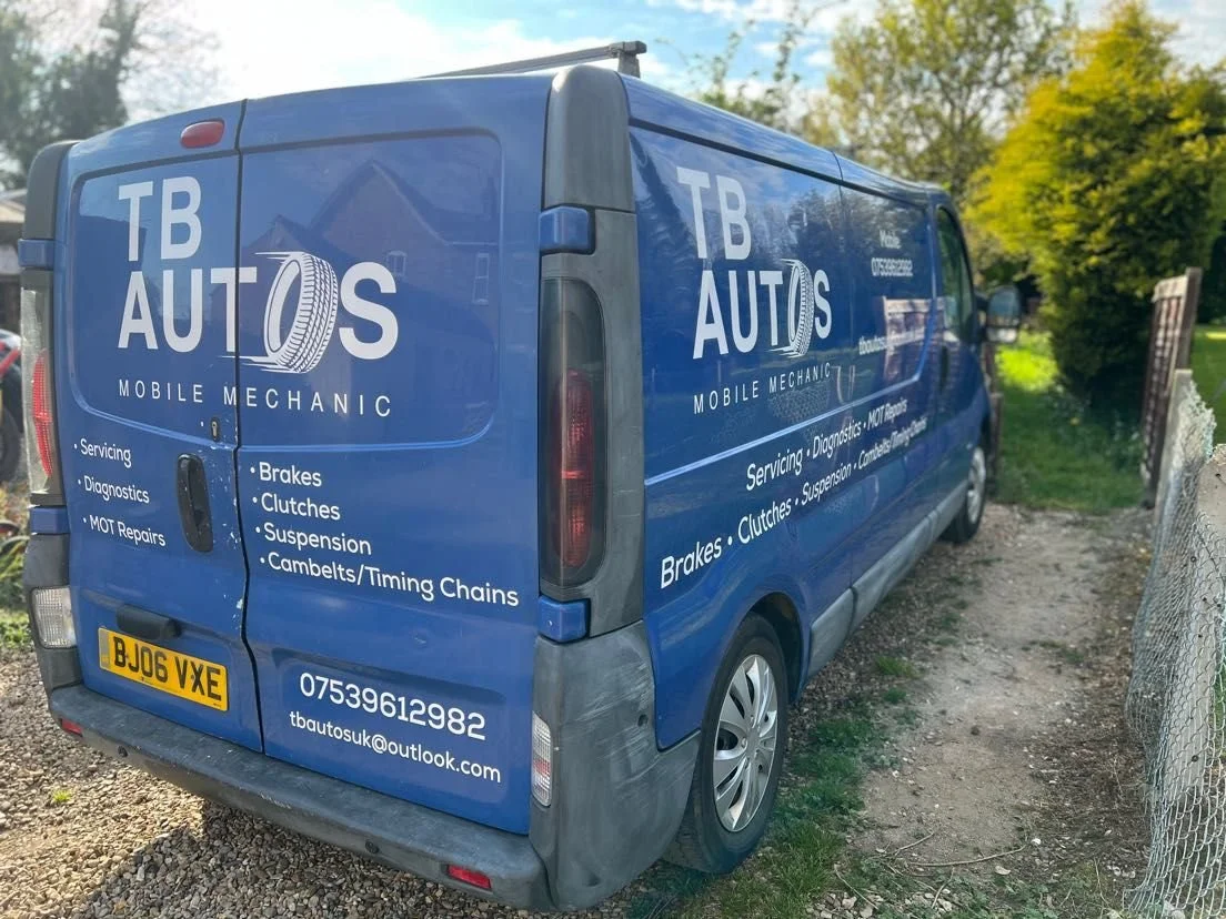
This is a commissioned logo for a freelance mobile mechanic based in Peterborough. Originally the client wanted a serif font matched with a wheel alloy, however after a discussion and creating some initial designs, he settled on the sans-serif font with the speeding wheel vector.
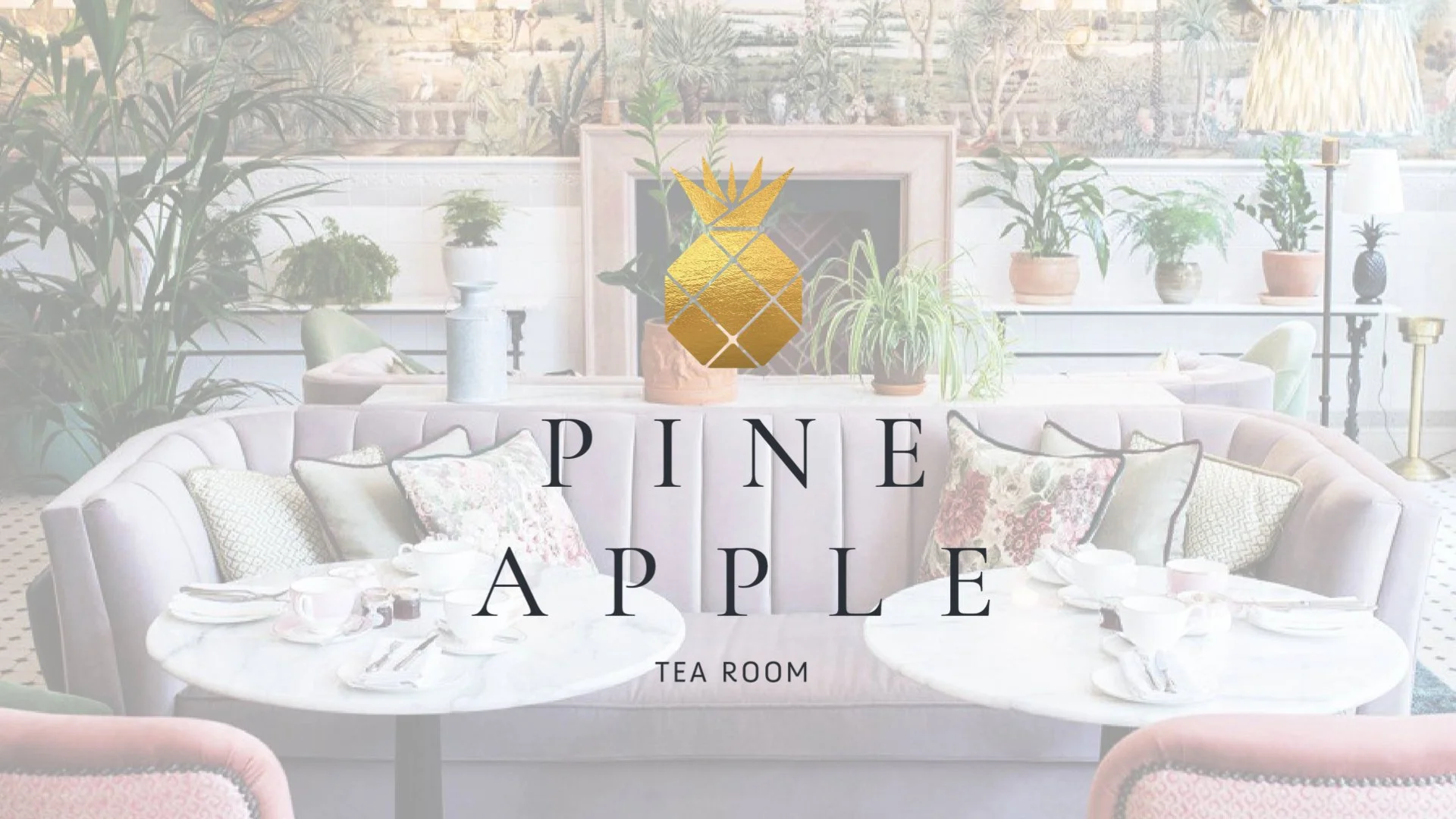
The pineapple is a traditional tearoom offering afternoon tea and cocktails for those looking for a more luxurious experience.
The summer house was originally used for growing Pineapples and other exotic fruits in the pits below, using the buildings history and Scottish heritage I have created a brand identity individual for just this location.
Using a colour palette of cream, gold and purple the identity has an atmosphere of luxury. The theme of three and layering can be seen throughout the touchpoint reflecting the manner of how the meal is served and how you would then eat it. The typeface has been chosen to be in keeping with the older traditions of afternoon tea bringing a higher-class approach to the touch-points.
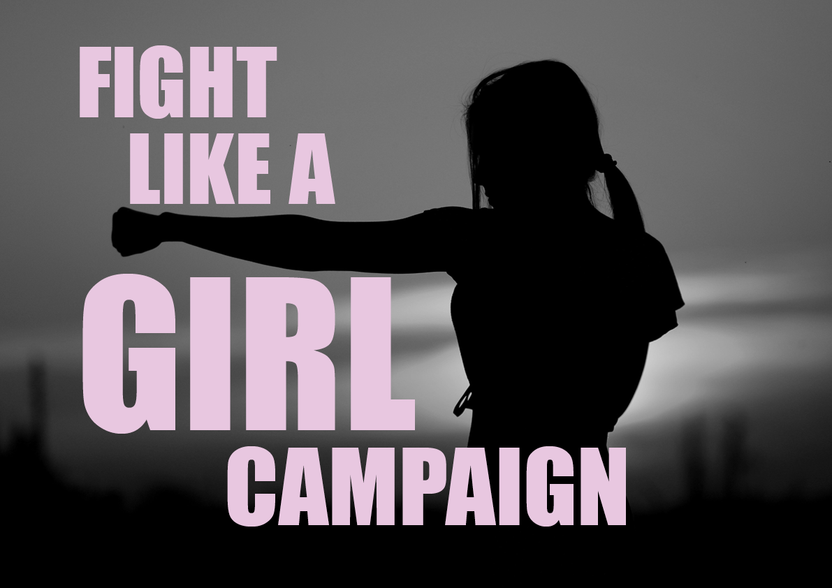
This is a design for good project to help tackle a particular issue. My issue is women’s safety and how to reduce the number of attacks. The campaign encourages women to join a self-defence class, partnering with the British Krav Mage Association. The design focuses on the rhythm of the movements within the type of the layout, the typeface used is IMPACT. The use of strong black and white photography helps to empower woman to become their best. The copy is based off of belittling thing that are said to woman to make them seem less powerful, these have now been turned into inspirational comments.
This project was shortlisted in the Creative Conscience Awards 2022.
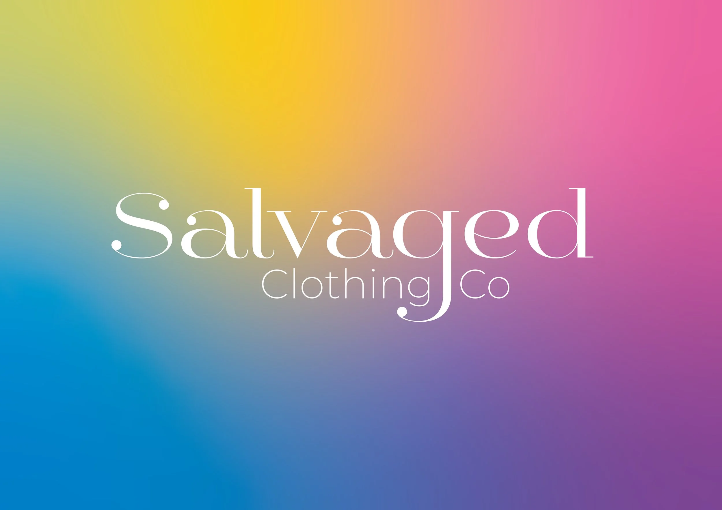
Fast fashion consumption is growing due to the ease of online shopping and the importance of your appearance on social media. 10,000 items of clothing are sent to landfill every 5minutes because of fast fashion. What's worse is that a large proportion of that number has been created by the returns process. Companies would rather dispose of garments as opposed to resell them. This means that our landfills are overflowing with brand new clothing.
Salvaged is an alternative returns process that prevents this from happening. By directing customers to salvaged, they will be able to claim their refunds and then their clothes will be resold in a Highstreet store for a reduce price.
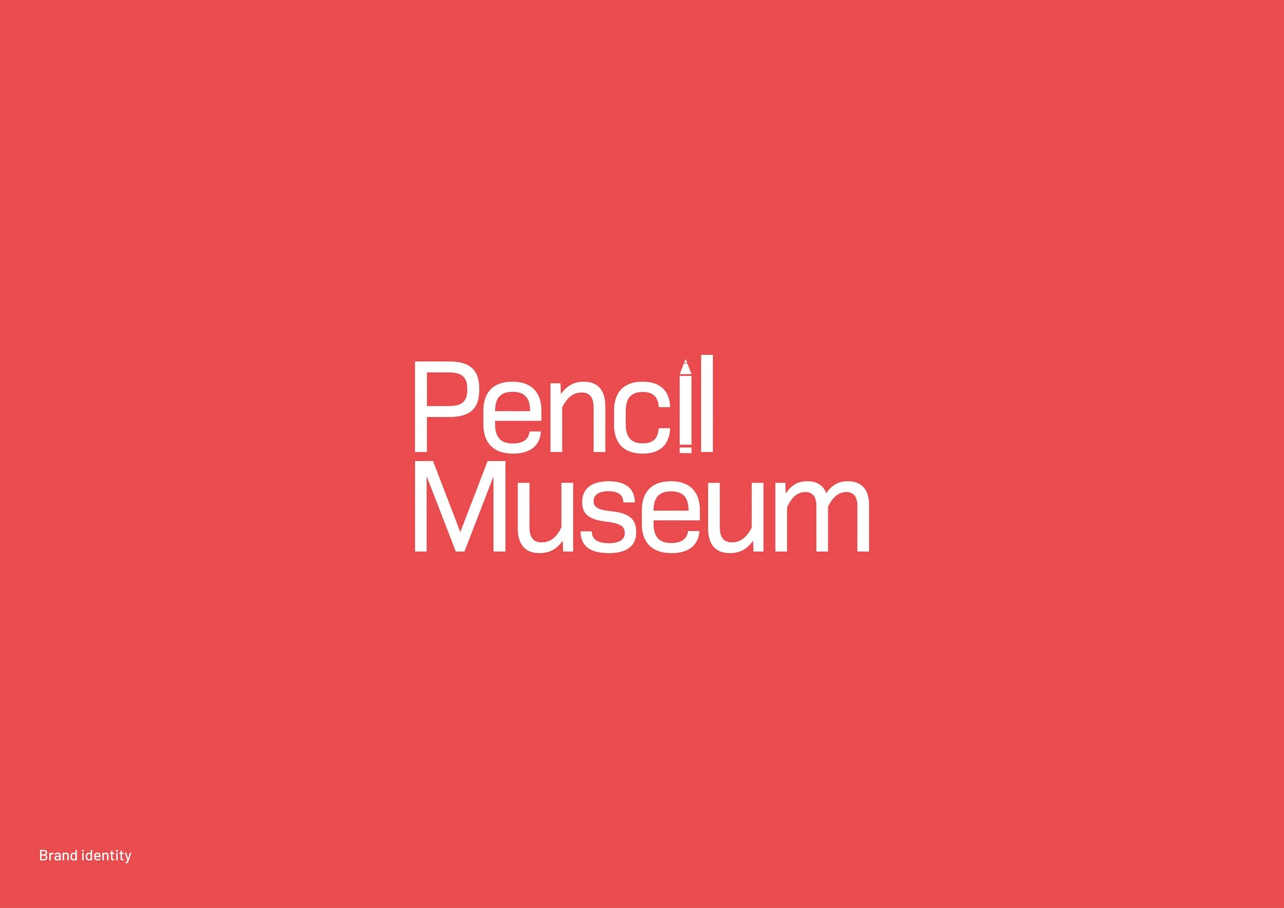
This brand identity has been created on the idea that pencils are in their simplest form and used to create primary foundations. By using a pencil, it is easy to adapt and change, making them ideal for children. I have chosen to use a colour palette that uses primary colours, this is to keep with the idea of foundations and simplicity whilst also being inviting for a younger audience. The identity contains 4 different brand patterns that can be used over a range of touchpoints, these have been generated from the shapes within the pencil itself. This identity should portray that this is a family friendly day out, that will be filled with hands on and engaging activities.
This project was to create a typeface based around a location, landmark or institution. I have chosen to base mine on Holkham hall in Norfolk.
My typeface is decorative as well as being functional to reflect how the house works, it also reflects the design style of the house by being elongated and arched to match the Palladian windows.
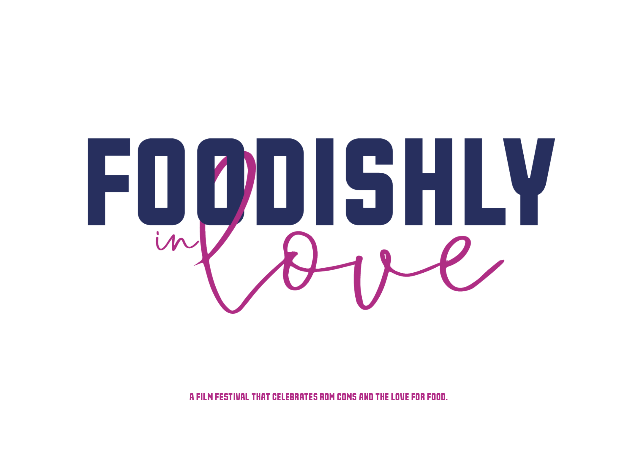
Foodishly in love is a brand identity project for a film festival. The films genera are rom-coms, and all things love. One key element to all rom-com movies is the significance of food scenes and no date would be complete without a romantic meal. Foodishly in love combines the love for both movies and snacks to bring you the perfect date. The festival is a whole day experience set out as mealtimes, beginning with breakfast and ending on dessert, we are showing 5 different films. The identity is based on witty food/love puns and a visual collage style to represent the combination of the two themes.
Credit to Richard Slade @sladedesign for the Photography and Original Campaign mark.
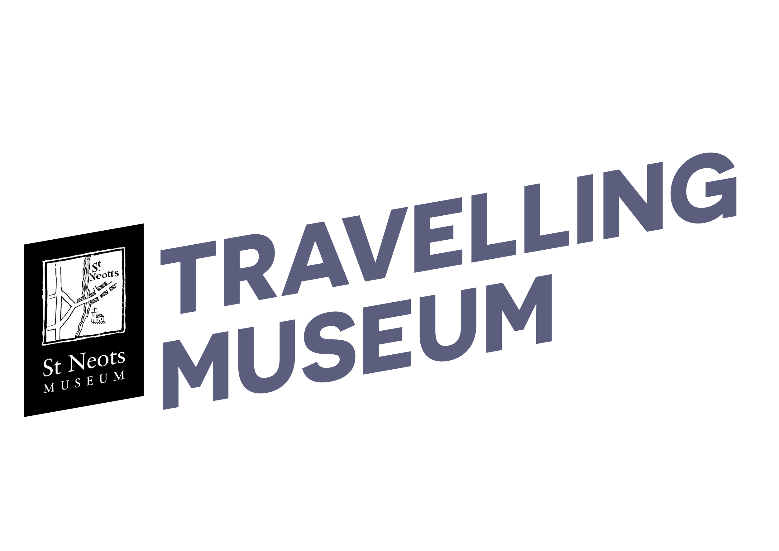
St Neots museum has commissioned a portable unit to help promote their museums and gain the interest of history for children. The unit will be set up at schools, pop up exhibitions and other community centres. The challenge was to try and organise a large quantity of information onto a small area, whilst being engaging and digestible enough for the audience to read.
Keystone is a marketing agency located in St Neots, focusing on helping companies develop their communications through specialised workshops. Keystone themselves needed more advertising materials to help reach a wider audience. These flyers highlighted the key steps that Keystone uses to increase engagement.
Keystone also produced feedback reports for each company they work with, meaning a template was needed to keep the brand cohesive. Style sheets were created and set so that any member of the team could edit the document.
St Neots dragon Boat team were looking to update and modernise their teams website. Taking inspiration from the sport and location the website has included a fluid movement from each page, using natural shapes to frame images and elements of importance. The site has also had a new colour palette introduced, this makes the page light and inviting for new members.
Small adjustments were made to pages that included forms to insure easy use for new and existing members.
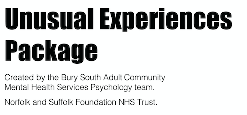
The management team of Suffolk and Norfolk mental health team commissioned a re-design of one of their patient's workbooks. They needed something that could be printed in-house by the team and would look cohesive in future workbooks. Patients needed a document that made sense, was easy to use and that they would want to engage with. The help of illustrations provides a break from the written content.
Client feedback:
'Oh wow-what a difference. This is brilliant, it is so much easier to read and looks professional-something I would be proud to give it to our service users. I am really pleased with it all, thank you so much.'